On this Friday of Color Theory Workshop II, Kat talked about there is a color system called Munsell Color System developed by Albert Munsell back in the beginning of 20th century. Munsell developed this color system is to define the color scientifically with numbers. Which means, each hue, shade, and tone that exist in his color system all gets a number. For example, you don't say "red-orange:, you say "red-#" (the number that it was assigned to). By doing this, the users will be able to indicate the color specifically without describing it.
After that explanation, we moved on to work with Munsell chips to identify which color of the chip belongs to a grid. This is an exercise developed for fine art or graphic design students to have a better understanding of Munsell color system and the overall color theory. The next door fine art professor walked in at this moment, looked at our group activity, and said "hey, we used to do this when we were in school back in the 80s and 90s! But then the university took it out because Art department doesn't have the budget to provide this, and there's no way you would ask a student to purchase $60 of Munsel book with exercises just to prove that colors can be defined scientifically." How interesting to find out about it!
Then we moved on to glazing technique....
Turns out I was the only one that brought acrylic paints, brushes (never ever use watercolor brushes for acrylic paints, you will cry afterwards...Because it damages the very soft tips of watercolor brushes), and water bucket. So Kat used my canvas to demonstrate the GLAZING technique that she was talking about last week, but she forgot to bring her materials due to the fact that she already carried a lot of materials to class.
To be quite honest with you, I think she was the only guest speaker that we had in Art Department that brought a lot of materials for 2 workshop sessions!!! This showed that how much she loves what she does as a graphic designer/design educator, and she is dedicated to teach others of her passion. I highly respect her on that.
Back to the topic....So she demonstrated how glazing was done:
1) put a layer of mid-tone sepia (brown) paint on the white canvas. Use water a lot for thinning the paint.
2) use paper towel to wipe away the thin and watered-down paint for highlight (Kat asked me what I wanted to paint for the canvas, and I said cloud, so that was what she did).
3) clean the brush, get blue + yellow + white paints on paper palette, mix a tiny bit of yellow with blue separately (don't mix with the blue puddle of paint). Add water to the mixed color, and then paint on the ocean + clouds where the shadows are at.
4) add more white for mid-tone in clouds.
5) keep mixing colors and enhance highlights or shadows.
The key to all this is the first layer got to be dried, like completely dried before you apply another color or same color but different tint/shade/tone. Otherwise you'll have a muddy painting! We don't want any muddy painting here. We want it to be clear and layered acrylic painting!
Like the following:
Close up
Kat Fon's website:
http://www.katfon.com/index.html
Sunday, May 15, 2011
Tuesday, May 10, 2011
ASA Photography Workshop: Robby Cavanaugh
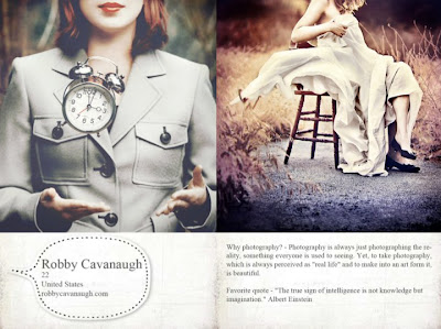
Image is from http://www.facebook.com/robbycavanaugh?ref=ts
Ever wondered about how professional photographers did wonders with their expensive DSLR cameras and fancy equipments?
This question has been around among regular people and people who had received art education in a university, but majority of us can't tell you how the trick of the trade is done. Not because we don't want to tell you the secret to look smart, it's simply because we don't know either. That is why when ASA (art student association) posted out a workshop on how one of the current graphic design student who happens to be a professional photographer did his magic, I signed up for attending on Facebook the minute I saw the post two weeks ago.
I went to the workshop today and found out his tricks. To my astonishment, it is something that I've known for years (I received my BFA in Graphic Design from Cal Poly, so yes, I am an alumni), but I just never thought it could be "played" this way.
Robby Cavanaugh, the speaker today, told us what tool he used: Photoshop. He showed us couple of YouTube videos that he recorded and uploaded to YouTube to show us how he did the tricks. Robby told us all those great photos out there done by professional photographers are HEAVILY EDITED after they took the photos. So there shouldn't be any guilt if we want great photos and we have to do the same to get there. He said he noticed that a lot of people in art department is just like him when he first started, he was kind of afraid to retouch the photos because it was kind of like cheating in a way. Since all the photographers do that for great photos, he later on changed his perspective and attitude towards post-editing.
What Robby did in photoshop to edit his photos are:
1) Begin with the dodge tool and burn tool to enhance the object that he wants to emphasize.
2) Go to use Edit--> Adjustment--> Curve to change the general colors.
3) Go to Edit--> Adjustment--> Color. Fine any brush, change the blending mode (do this at the Layer window), change the opacity %, and pick a color. This is to enhance the color in general.
4) Masks--this is to combine with the gradient tool so you can create a gradient on the entire photo.
5) Sharpen and Vignette
Sharpen is to make your object super sharp, but the bad thing is, if the photo quality is low, the piexelated area will be more visible, so you have to beware of that. Filter-->Other--High pass, enter a number between 2.5-4 pixels. Then go to blending more and choose Overlay on the right hand side of the canvas (where Layer window is at). You can use eraser tool on the left tool bar to erase areas you don't want it to sharpen.
Vignette, that is to darkened corners around 4 corners of your photo. Use Dodge tool, change exposure to 30% around photos corners.
Once I get Robby's Youtube video links from him, I'll post that here too, but so far, I only have his photography website. If you like his work, and you want to hire him to do your graduation photos/portraits/wedding/engagement, you can ask him and discuss the price/location!
http://www.robbycavanaugh.com
Saturday, May 7, 2011
Color Theory Workshop Part I
On Friday, May 7th, I attended a color theory workshop hosted by ASA Club (art student association) in art department building. The workshop ran from 1pm to 4pm with two breaks.
I've got to say, I'm very very glad that I went!!!
The guest speaker, Kat Fon, is a graphic designer herself, and she has taught CSU Los Angeles after she got her MFA there, and then teaches in Westwood College in LA campus for 3 years now. What she had covered was simply something that we've heard from our graphic designer professors (or fine art professors) about RGB, Grayscale, CMYK, Duotone, and Bitmap in fine art, graphic design, and prints.
**Ok, I know this is pretty much like alien languages to whoever is reading this post right now, but if you are into fine art/graphic design/game art/illustration, then color theory class is a must take course that will save your life + career! Because everything starts from the fundamental (just like a foundation for building a house)!
She also talked about the difference between spot color VS process color when going into print (after the design part is done), and certain things that we need to look for when we get to that. She also shared an adds-on called Kuler that we can download from Adobe.com.
What Kuler does is, it allows you to find color scheme for whatever design/atmosphere you're doing.....Let's say you are being hired to paint a dark, moody, surreal sky with a castle on top of the cloud, you need a color palate that shows all these descriptions (aka keywords). So in Kuler, you type in these key words, and Kuler will show you lots of color scheme for you, and you can save them!
Here is a link to Kuler:
http://www.kuler.adobe.com
You must sign up for a free account with Adobe so you can use this free feature! There is also a Kuler desktop widget that you can download, you don't have to go to the kuler's website to find color schemes if you're lazy.....So take advantage of that!
Thursday, May 5, 2011
2D 3D Show framing + drop off
Phew, man, it was really not easy to prepare 8 plexiglas frame for 8 pieces! But I'm really glad that I got it done and over with for sure!
That was what I could think of after I returned home from Cal Poly's gallery on campus yesterday. What happened is that after I submitted 8 pieces of digital illustrations in mid-April, I was informed by the ASA (Art Student Association) president, Jeorge, that 6 of my art pieces got into the show for this year. When he told me that after a workshop was over, I really thought he was joking and I simply stared at him for 2 minutes. Somehow he and his friend thought that was hilarious so they totally cracked up for the next 5 minutes.
The next day, I went to get all my artworks in Art Department's faculty lounge. As Jeorge flipped through the record book, he told me that he gave me the wrong number, I actually have all 8 of my works in for 2D 3D Show.
And that is how my nightmare started.......
What happened is that this year, the 2D 3D Show curator asked for students who got their works selected, must use plexiglas as the frame. Turns out in Home Depot, the staff called it acrylic glass, which is fake glass made with plastic. That is all fine and all, but here comes the problem, the glass cutter that I got from Home Depot recommended by staff didn't work! It just won't cut the plexiglas at all!
*Plexiglas is a smooth piece of glass that could go from 11"x14" to 36"x48"....
So I had to pull all my resources on Facebook begging people for help. Finally, my fine art professor saw my SOS message on Facebook, and she told me I could come to the Art building and she will have a student to cut the plexiglas for me since I'm not allowed to use the tools there.
Up to that point, I only had 3 days left for the last day to turn in my framed artworks. The deadline is May 5th. I really didn't care, I just wanted to make sure everything is done and I can turn in art pieces on time. Lucky for me, I was able to asked that art student to cut 8 pieces of plexiglas while I was next to her cleaning up before she start cutting the next piece. I really have to say, cutting the plexiglas wasn't grueling, the hardest part was measuring all 8 plexiglas AND 8 black illustration boards. That wasn't fun at all. Just the measuring itself took me 4 hours for 2 days to do.....Because every piece of plexiglas needs to be perfect size for the black illustration board that it goes to.
On Wednesday, May 4rd, I was able to turned in 3 pieces; by May 4rd, I turned in all 5 remaining pieces and thought. Of course, I rushed to school gallery before it was closed, hahaha. But I'm proud to say, man, I'm glad I did all this and went through all the troubles. Because now everything is over and all I have to do is to show up on the reception day to meet all the alumni and professors!
The reception is on Sunday, May 22nd, from 2pm~5pm. You guys are all invited to come! No tickets need to be purchased! It's free to public!
This is the gallery entrance, between Student Union and Theatre Department building.
This is the picture that I took when I dropped off my frames....Just to show that I really was there.....
This is the University Art Gallery link:
http://dsa.csupomona.edu/uhs/campusartgall.asp
Sunday, May 1, 2011
Alexander McQueen Bridal Gown for Kate Middleton (for GED 578)
Images from http://www.weddinginspirasi.com/2011/04/30/kate-middletons-wedding-dress-designed-by-sarah-burton-alexander-mcqueen/
I'm not sure if the public feel the same way about Kate Middleton's wedding gown like I do. I think her wedding gown is just so not the style from Alexander McQueen. Even if it's designed by Sarah Burton, the current design director of the brand, Alexander McQueen. Even though she and Alexander McQueen used to be classmates when they were both in the fashion design school, but her style of work is just not Alexander McQueen.
Alexander McQueen is known for his imaginary, almost fantasy, but definitely glamorous couture designs on the runway. He is a genius. I was captivated by his couture line back in Fall 2008. And yes, the collection made me fell in love with his design ability and aesthetic perspective from his Fall 2008 RTW collection.
Here are couple of images from that collection:
Images are from http://nymag.com/fashion/fashionshows/
When Alexander McQueen was interviewed and was asked about what inspired him to do this collection, his answer was he dreamed of a young girl who lives in the wood but came out from the darkness as a queen. In my opinion, that is pretty fantasy. Which is something that I'm interested in novel and digital illustration. I just never thought a fashion designer would actually turned it into a reality and designed a whole series of collection based on his dream. This collection was simply so beautiful to a point that it is surreal.
But what happened to Kate Middleton's wedding gown done by Sarah Burton of Alexander McQueen? I'm disappointed.
~~~~~~~~~~~~~~~~~~~~~~~~~~~~~~~~~~~~~~~~~~~~~~~~~~
This is the New York Fashion Shows website where it has all the fashion designers' works and collections. You can check out Alexander McQueens collections by clicking on the "Designer" tab to look at his name, and choose the year of collection that you want to view.
http://nymag.com/fashion/fashionshows/
This is a video of Alexander McQueen's 2008 Fall collection that I've showed bunch of pictures in this post.
http://www.youtube.com/watch?v=BcBKBiOoFq0
This is the official YouTube channel that shows all the royal wedding videos.
http://www.youtube.com/user/TheRoyalChannel?blend=1&ob=5
Subscribe to:
Posts (Atom)