Wednesday, November 23, 2011

Franc's Chocolates - Day 5

11/23/2011 Wed.

Seattle is a city full of art and design, there's no question about it. It has more furniture store and restaurants that aim for life-enhancing experience more than what I would see in LA. Most of them are very low-profile, not as noticeable to find if you don't pay attention to their small signage. Chocolate store, Fran's Chocolates, is one of them. I almost passed by it if it wasn't for my family members who had been there before to point it out for me.

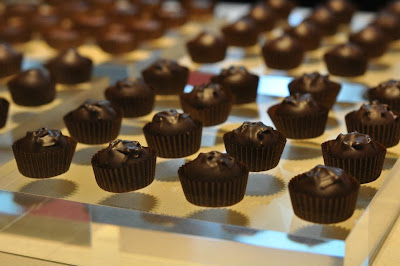
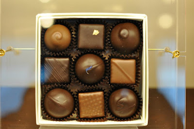
Fran's Chocolate sells hand-made chocolates and chocolate-relate
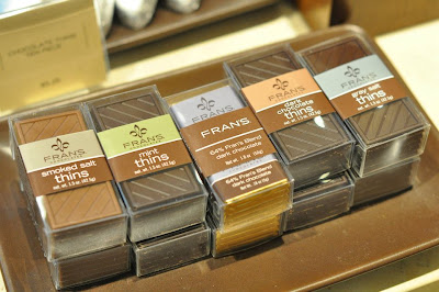
d sweet beverages in the store. I'm more into their package designs and logo more than anything else in the store. The logo is simple with the word "Fran's" being stretched out in a san serif font. The word "chocolates" is very small and compressed, sitting next to "Fran's" quietly. I personally prefer looking at the package design at the entrance, and then move on to the chocolates sitting quietly behind the counter glass.

The interior was decorated with tall ceiling, massive white marble floor, and brown in-set display cases that are full of Fran's Chocolate's chocolate boxes. The display cases and counter glass are the only two spots where chocolates can be seen, which makes it easier for the customers to find the items. Which reminds me of how Godiva does it differently in
LA....The whole entire store has chocolates everywhere in a Godiva store. It makes me having a headache just to find what I need.

Design is very important. It allows your audience (clients) to know what you got to show, and what you want them to know without being lost. When you lost your audience, your design has pretty much failed.





Tuesday, November 22, 2011

Museum of Flight - Day 4

11/22/2011 Tues.

Although I've been to Sea-Toc (Seattle Airport) and Downtown Seattle several times, I never really step foot into the Museum of Flight once. I remember a few years ago I came here with family to Seattle, and we were talking about that we want to check the Museum of Flight out, but we never did. Now this year, thanks to my family members who are courageous enough to give it a shot, here I am in Museum of Flight while it was raining in Seattle.

Museum of Flight is located between Sea-Toc and Downtown Seattle, so it was a good 30 minutes of driving from where my friend's apartment is at. I found that the museum is pretty generous on moving all the old airplanes into the huge window building, took out all the engines, repainted the airplanes, and arranged them in different show rooms. Somehow, to me, it feels more like walking around and looking around. There was not a lot of activities going on though. The photography is allowed in most of the exhibition areas except two rooms in a
red barn place. Those rooms are the ones with the diaries, publications, and newspaper records of the important people in the history of making planes. Too bad I can't remember all their names, but it was kind of funny that I got stopped by a security while I tried to take a photo of the model airplane invented by Wright Brothers in a dim room.


Monday, November 21, 2011

Velocity - Day 3

11/21/2011 Mon.

Talking about design in daily life, home deco or furniture is the most easily accessed to. So I went to Velocity store to find out what it is all about that some people are very dedicated in this form of art.

http://www.velocityartanddesign.com/

Velocity is a furniture business that aims for organic modernism style to incorporate art and design in daily life. They value creativity and quality. It is a store that cares about simplicity that lasts
for decades. I was introduced to it by a family friend who is in Seattle for 10 years, and I'm glad that I went to Velocity in Downtown Seattle!


Sunday, November 20, 2011

Fremont Vintage Market - Day 2

11/20/2011 Sun.

Fremont Vintage Market is not too far from where I stayed a
t, Mill Creek, and it is considered the residential area with collectors of vintage items and artists.

I found out that it sits between residential area and busin
ess offices, and Google office is among them. How interesting! There were a lot of people at the Fremont Vintage Market, most of them are Caucasians, rarely I saw a few Asian faces. But that's expected since Seattle doesn't have that many Asians or Hispanic populations like we have in California.

Going through booths by booths, I realized that some of them sell very very old items from their grandparent's time, or promoting their hand-made crafts. Som
e booth owner even sells cookies, hot meals, and coffee. It seems that the vintage market is more of a fun gathering place than a serious display of collection of objects. People are more relaxed than California's swap meet that I've been to in Pomona and City of Industry.

The items that are common to see in this market are fur coats, Asian-inspired robes, big piece jewelries, recreated pieces from old items, paper-made accessories, and furniture.


SAM- Seattle Art Museum - Day 1

11/19/2011 Sat.

Ok, so I guess it's not exactly that fun when I have a cold and I still don't want to waste my educational trip up to Seattle....Battling with headache and a running nose while trying not to disturb other visitors in Seattle Art Museum surely wasn't easy! But I had to do it anyway.

So the 1st day in Seattle is to go visit Seattle Art Museum.
http://www.seattleartmuseum.org/

I came here for the Luminous exhibition on Asian art at the 3rd floor, where they are a lot of Buddha carvings and torsos of Buddha. There are some other Japanese screens painted with gold or made by fabrics, some displays were old Japanese daily clothing from poets back in that time era. It is interesting to see how the museum arranges different exhibitions at the same floor, how they changed the color of the paint on the wall to differentiate each exhibition, and how they occasionally don't have the light hit on the displayed item directly.

The 2nd floor has more European paintings, the 1st floor is mostly modern installation art.


Sunday, November 13, 2011

Web Design Workshop in Santa Monica - Day 2

11/13/2011 Sunday

So I got up a bit late this morning, around 6:15am instead of 6am like yesterday. What happened was since Jose (the workshop host) said we'll all be meeting at 9am, I figured I can just show up at 9AM sharp instead of 8:30am. I do need extra time on catching up with some sleep, so I chose to leave the house around 8:15am.

When I got there at Blanc Space, everyone already seated and I thought "Oh crap, I'm late". Later on I found out that I wasn't the only one that thought we're suppose to show up at 9AM sharp, haha. Oh well. It is ok, at least the workshop didn't get in there when the workshop is half way done.

It was very easy this time driving on the freeway. Much less cars and the weather was very nice. It was a sunny day and the temperature was much higher compare to yesterday. It was so cold, windy, and cloudy yesterday that I thought it might just start to rain at any second.

So I went to the group and joined the workshop......Now we're working on the web design part! Yes! After learning how to prioritize, assign workload to all members, and design sprint time, now we're totally on the web design part, where we'll learn about the process, what are the most important components of that process, actually doing the exercise to get it, etc.

Saturday, November 12, 2011

Web Design Workshop in Santa Monica - Day 1

11/12/2011 Saturday

I signed up for this workshop pretty last minute....I didn't know about this workshop until Thursday of November 10th in CSULA at the end of an AIGA guest speaker's speech. I was pretty enthusiastic about it that night, but then somehow when I got back home from CSULA, I honestly had to think it over. Really think it over, a lot.

It's not about the money (yes, this workshop requires whoever signs up paying for the event). It's about the timing. I have graphic design lesson plan to do (since the previous art teacher left nothing for me to use), graduate coursework (totally behind on that, and I'm not the only one suffering), and illustration project to do over this 3-day weekend (thanks to the Veteran's Day).

I was debating on whether or not I should go and get myself more educated the whole day yesterday. I told myself I really need this break because teaching high school has been really really tiring and I need to get my work done (whatever they are). But then, just last night, an hour before the midnight, I saw the host's response email, and I thought, "Damn, this guy cares about what he does!" And that really struck a cord in me, so I signed up right away and emailed him back on what I was debating for a long long time....


So now I'm sitting in Blanc Space in Santa Monica, extremely close to Sana Monica Mall (more like 20 steps away from it, not kidding!), at the 2nd street.


I can't list out exactly what I do in this workshop, because it's only for the people that paid for the training to know, but I can tell you it's all about increasing work flow ,progress, effective management, and know a new system of designing with a team so that everybody works happy and satisfied with what they do in the team.

This workshop is hosted by Groop Skool in Santa Monica. This is their 3rd workshop so far in this year.

Sunday, May 15, 2011

Color Theory Workshop Part II

On this Friday of Color Theory Workshop II, Kat talked about there is a color system called Munsell Color System developed by Albert Munsell back in the beginning of 20th century. Munsell developed this color system is to define the color scientifically with numbers. Which means, each hue, shade, and tone that exist in his color system all gets a number. For example, you don't say "red-orange:, you say "red-#" (the number that it was assigned to). By doing this, the users will be able to indicate the color specifically without describing it.

After that explanation, we moved on to work with Munsell chips to identify which color of the chip belongs to a grid. This is an exercise developed for fine art or graphic design students to have a better understanding of Munsell color system and the overall color theory. The next door fine art professor walked in at this moment, looked at our group activity, and said "hey, we used to do this when we were in school back in the 80s and 90s! But then the university took it out because Art department doesn't have the budget to provide this, and there's no way you would ask a student to purchase $60 of Munsel book with exercises just to prove that colors can be defined scientifically." How interesting to find out about it!

Then we moved on to glazing technique....

Turns out I was the only one that brought acrylic paints, brushes (never ever use watercolor brushes for acrylic paints, you will cry afterwards...Because it damages the very soft tips of watercolor brushes), and water bucket. So Kat used my canvas to demonstrate the GLAZING technique that she was talking about last week, but she forgot to bring her materials due to the fact that she already carried a lot of materials to class.

To be quite honest with you, I think she was the only guest speaker that we had in Art Department that brought a lot of materials for 2 workshop sessions!!! This showed that how much she loves what she does as a graphic designer/design educator, and she is dedicated to teach others of her passion. I highly respect her on that.

Back to the topic....So she demonstrated how glazing was done:

1) put a layer of mid-tone sepia (brown) paint on the white canvas. Use water a lot for thinning the paint.
2) use paper towel to wipe away the thin and watered-down paint for highlight (Kat asked me what I wanted to paint for the canvas, and I said cloud, so that was what she did).
3) clean the brush, get blue + yellow + white paints on paper palette, mix a tiny bit of yellow with blue separately (don't mix with the blue puddle of paint). Add water to the mixed color, and then paint on the ocean + clouds where the shadows are at.
4) add more white for mid-tone in clouds.
5) keep mixing colors and enhance highlights or shadows.

The key to all this is the first layer got to be dried, like completely dried before you apply another color or same color but different tint/shade/tone. Otherwise you'll have a muddy painting! We don't want any muddy painting here. We want it to be clear and layered acrylic painting!

Like the following:


Close up


Kat Fon's website:
http://www.katfon.com/index.html

Tuesday, May 10, 2011

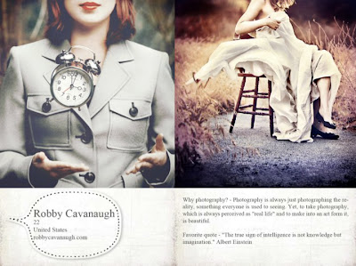
ASA Photography Workshop: Robby Cavanaugh


Image is from http://www.facebook.com/robbycavanaugh?ref=ts


Ever wondered about how professional photographers did wonders with their expensive DSLR cameras and fancy equipments?

This question has been around among regular people and people who had received art education in a university, but majority of us can't tell you how the trick of the trade is done. Not because we don't want to tell you the secret to look smart, it's simply because we don't know either. That is why when ASA (art student association) posted out a workshop on how one of the current graphic design student who happens to be a professional photographer did his magic, I signed up for attending on Facebook the minute I saw the post two weeks ago.

I went to the workshop today and found out his tricks. To my astonishment, it is something that I've known for years (I received my BFA in Graphic Design from Cal Poly, so yes, I am an alumni), but I just never thought it could be "played" this way.

Robby Cavanaugh, the speaker today, told us what tool he used: Photoshop. He showed us couple of YouTube videos that he recorded and uploaded to YouTube to show us how he did the tricks. Robby told us all those great photos out there done by professional photographers are HEAVILY EDITED after they took the photos. So there shouldn't be any guilt if we want great photos and we have to do the same to get there. He said he noticed that a lot of people in art department is just like him when he first started, he was kind of afraid to retouch the photos because it was kind of like cheating in a way. Since all the photographers do that for great photos, he later on changed his perspective and attitude towards post-editing.

What Robby did in photoshop to edit his photos are:
1) Begin with the dodge tool and burn tool to enhance the object that he wants to emphasize.

2) Go to use Edit--> Adjustment--> Curve to change the general colors.

3) Go to Edit--> Adjustment--> Color. Fine any brush, change the blending mode (do this at the Layer window), change the opacity %, and pick a color. This is to enhance the color in general.

4) Masks--this is to combine with the gradient tool so you can create a gradient on the entire photo.

5) Sharpen and Vignette
Sharpen is to make your object super sharp, but the bad thing is, if the photo quality is low, the piexelated area will be more visible, so you have to beware of that. Filter-->Other--High pass, enter a number between 2.5-4 pixels. Then go to blending more and choose Overlay on the right hand side of the canvas (where Layer window is at). You can use eraser tool on the left tool bar to erase areas you don't want it to sharpen.

Vignette, that is to darkened corners around 4 corners of your photo. Use Dodge tool, change exposure to 30% around photos corners.


Once I get Robby's Youtube video links from him, I'll post that here too, but so far, I only have his photography website. If you like his work, and you want to hire him to do your graduation photos/portraits/wedding/engagement, you can ask him and discuss the price/location!
http://www.robbycavanaugh.com

Saturday, May 7, 2011

Color Theory Workshop Part I


On Friday, May 7th, I attended a color theory workshop hosted by ASA Club (art student association) in art department building. The workshop ran from 1pm to 4pm with two breaks.

I've got to say, I'm very very glad that I went!!!

The guest speaker, Kat Fon, is a graphic designer herself, and she has taught CSU Los Angeles after she got her MFA there, and then teaches in Westwood College in LA campus for 3 years now. What she had covered was simply something that we've heard from our graphic designer professors (or fine art professors) about RGB, Grayscale, CMYK, Duotone, and Bitmap in fine art, graphic design, and prints.

**Ok, I know this is pretty much like alien languages to whoever is reading this post right now, but if you are into fine art/graphic design/game art/illustration, then color theory class is a must take course that will save your life + career! Because everything starts from the fundamental (just like a foundation for building a house)!

She also talked about the difference between spot color VS process color when going into print (after the design part is done), and certain things that we need to look for when we get to that. She also shared an adds-on called Kuler that we can download from Adobe.com.

What Kuler does is, it allows you to find color scheme for whatever design/atmosphere you're doing.....Let's say you are being hired to paint a dark, moody, surreal sky with a castle on top of the cloud, you need a color palate that shows all these descriptions (aka keywords). So in Kuler, you type in these key words, and Kuler will show you lots of color scheme for you, and you can save them!

Here is a link to Kuler:
http://www.kuler.adobe.com

You must sign up for a free account with Adobe so you can use this free feature! There is also a Kuler desktop widget that you can download, you don't have to go to the kuler's website to find color schemes if you're lazy.....So take advantage of that!

Thursday, May 5, 2011

2D 3D Show framing + drop off

Phew, man, it was really not easy to prepare 8 plexiglas frame for 8 pieces! But I'm really glad that I got it done and over with for sure!

That was what I could think of after I returned home from Cal Poly's gallery on campus yesterday. What happened is that after I submitted 8 pieces of digital illustrations in mid-April, I was informed by the ASA (Art Student Association) president, Jeorge, that 6 of my art pieces got into the show for this year. When he told me that after a workshop was over, I really thought he was joking and I simply stared at him for 2 minutes. Somehow he and his friend thought that was hilarious so they totally cracked up for the next 5 minutes.

The next day, I went to get all my artworks in Art Department's faculty lounge. As Jeorge flipped through the record book, he told me that he gave me the wrong number, I actually have all 8 of my works in for 2D 3D Show.

And that is how my nightmare started.......

What happened is that this year, the 2D 3D Show curator asked for students who got their works selected, must use plexiglas as the frame. Turns out in Home Depot, the staff called it acrylic glass, which is fake glass made with plastic. That is all fine and all, but here comes the problem, the glass cutter that I got from Home Depot recommended by staff didn't work! It just won't cut the plexiglas at all!

*Plexiglas is a smooth piece of glass that could go from 11"x14" to 36"x48"....

So I had to pull all my resources on Facebook begging people for help. Finally, my fine art professor saw my SOS message on Facebook, and she told me I could come to the Art building and she will have a student to cut the plexiglas for me since I'm not allowed to use the tools there.

Up to that point, I only had 3 days left for the last day to turn in my framed artworks. The deadline is May 5th. I really didn't care, I just wanted to make sure everything is done and I can turn in art pieces on time. Lucky for me, I was able to asked that art student to cut 8 pieces of plexiglas while I was next to her cleaning up before she start cutting the next piece. I really have to say, cutting the plexiglas wasn't grueling, the hardest part was measuring all 8 plexiglas AND 8 black illustration boards. That wasn't fun at all. Just the measuring itself took me 4 hours for 2 days to do.....Because every piece of plexiglas needs to be perfect size for the black illustration board that it goes to.

On Wednesday, May 4rd, I was able to turned in 3 pieces; by May 4rd, I turned in all 5 remaining pieces and thought. Of course, I rushed to school gallery before it was closed, hahaha. But I'm proud to say, man, I'm glad I did all this and went through all the troubles. Because now everything is over and all I have to do is to show up on the reception day to meet all the alumni and professors!

The reception is on Sunday, May 22nd, from 2pm~5pm. You guys are all invited to come! No tickets need to be purchased! It's free to public!


This is the gallery entrance, between Student Union and Theatre Department building.


This is the picture that I took when I dropped off my frames....Just to show that I really was there.....


This is the University Art Gallery link:
http://dsa.csupomona.edu/uhs/campusartgall.asp

Sunday, May 1, 2011

Alexander McQueen Bridal Gown for Kate Middleton (for GED 578)


Images from http://www.weddinginspirasi.com/2011/04/30/kate-middletons-wedding-dress-designed-by-sarah-burton-alexander-mcqueen/


I'm not sure if the public feel the same way about Kate Middleton's wedding gown like I do. I think her wedding gown is just so not the style from Alexander McQueen. Even if it's designed by Sarah Burton, the current design director of the brand, Alexander McQueen. Even though she and Alexander McQueen used to be classmates when they were both in the fashion design school, but her style of work is just not Alexander McQueen.

Alexander McQueen is known for his imaginary, almost fantasy, but definitely glamorous couture designs on the runway. He is a genius. I was captivated by his couture line back in Fall 2008. And yes, the collection made me fell in love with his design ability and aesthetic perspective from his Fall 2008 RTW collection.

Here are couple of images from that collection:


Images are from http://nymag.com/fashion/fashionshows/


When Alexander McQueen was interviewed and was asked about what inspired him to do this collection, his answer was he dreamed of a young girl who lives in the wood but came out from the darkness as a queen. In my opinion, that is pretty fantasy. Which is something that I'm interested in novel and digital illustration. I just never thought a fashion designer would actually turned it into a reality and designed a whole series of collection based on his dream. This collection was simply so beautiful to a point that it is surreal.

But what happened to Kate Middleton's wedding gown done by Sarah Burton of Alexander McQueen? I'm disappointed.


~~~~~~~~~~~~~~~~~~~~~~~~~~~~~~~~~~~~~~~~~~~~~~~~~~


This is the New York Fashion Shows website where it has all the fashion designers' works and collections. You can check out Alexander McQueens collections by clicking on the "Designer" tab to look at his name, and choose the year of collection that you want to view.
http://nymag.com/fashion/fashionshows/

This is a video of Alexander McQueen's 2008 Fall collection that I've showed bunch of pictures in this post.
http://www.youtube.com/watch?v=BcBKBiOoFq0

This is the official YouTube channel that shows all the royal wedding videos.
http://www.youtube.com/user/TheRoyalChannel?blend=1&ob=5